Today at Wordans, we’re excited to announce a refresh of our product, inspired by invaluable feedback and ideas from our team members and customers. Our focus has been creating a lighter, faster, and more user-friendly experience. Although there’s still much more to come, this is our first step in our journey:
Why the New Look?
After 10 years in the market, we’ve come to understand that updating the look of the Wordans website is more than just a cosmetic change; it’s a smart business move.
A fresh, modern design will improve user experience by making navigation intuitive and ensuring the site is mobile-friendly, catering to the growing number of smartphone users. This makeover breathes new life into our brand, showing that we keep up with the times and care about innovation. It helps us stand out in a crowded market and boosts the perceived quality of our products.
Ultimately, a sleek, modern website builds trust with our audience, increases conversions, and supports our business’s growth by integrating seamlessly with new tools and analytics. So, if we haven’t given our website a facelift in a decade, now’s the perfect time to make that change!
We’re excited about these updates and look forward to providing an even better experience for our valued customers!

What Inspires Our New Look
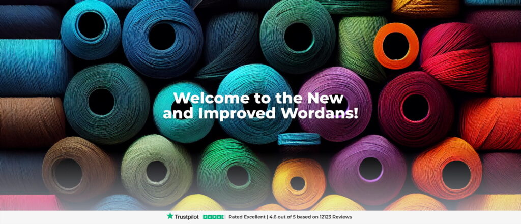
We’re excited to share our fresh new look with you! We’ve redesigned our site to be more welcoming and easier to use. The new design features a lighter tone and friendly shapes, making everything look nicer and easier to navigate.
We’ve embraced simplicity, removing away unnecessary elements to focus on clean lines and an uncluttered layout. This approach not only enhances the visual appeal but also improves accessibility, ensuring users can find what they need quickly and effortlessly.
Our new look draws inspiration from multiple sources, including our competitors and suppliers, as well as the dynamic tech environment that surrounds us. By incorporating these diverse influences, we’ve crafted a design that reflects the best of current trends and technological advancements. This new look reflects our commitment to making your experience with us as smooth and enjoyable as possible. Welcome to the new and improved us, where simplicity meets practicality! (or so I hope)
Behind our Visuals
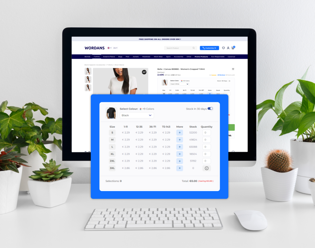
In the dynamic world of e-commerce, visuals are more than just a decoration, they’re our bridge to creating meaningful connections with customers. Our new look at Wordans embodies this philosophy with a calming blue palette, rounded shapes, and lighter contrasts. These elements not only enhance usability but also evoke a sense of trust and modernity, ensuring every visit is both engaging and visually appealing. Our redesign isn’t just a makeover; it’s a promise to offer an immersive experience that connects with our audience the moment they arrive.
- Blue-Toned Color Palette: Our new design prominently features a soothing blue-toned color palette coming from our iconic Wordans blue. Shades of blue are known for their calming effect and versatility, making them ideal for creating a serene and professional atmosphere on our website.
- Rounded Shapes: You’ll notice a shift towards more rounded shapes in our new design elements, from buttons to containers and product showcases. These softer, more organic shapes contribute to a friendly and approachable visual aesthetic, enhancing the overall user experience.
- Lighter Contrasts: By using lighter contrasts, such as soft grays and pastel shades alongside our dominant blues, we ensure that the focus remains on the products. By reducing distractions, we highlight the quality and appeal of what we offer, making it easier for you to find exactly what you’re looking for.
This fresh approach to visual elements isn’t confined to our website alone; it extends across all our communication channels, creating a cohesive and distinctive brand identity. Whether they are browsing our site, engaging with our social media, or receiving and reading our newsletters, they should experience a unified visual language that reflects our commitment to quality, innovation, and customer satisfaction.
What’s Coming in the Future:
We’re thrilled with the improvement we’ve made in visuals and functionality, but our journey doesn’t stop here. We’re committed to refining and perfecting our digital products even further. We aim to unlock their full potential and bring fresh ideas that enhance your bulking shopping experience.
Did we make you curious? Good, that was our intention! Explore our website to discover our diverse range of products and offers. Take a look at our Instagram page @wearewordans for insights and inspiration.